

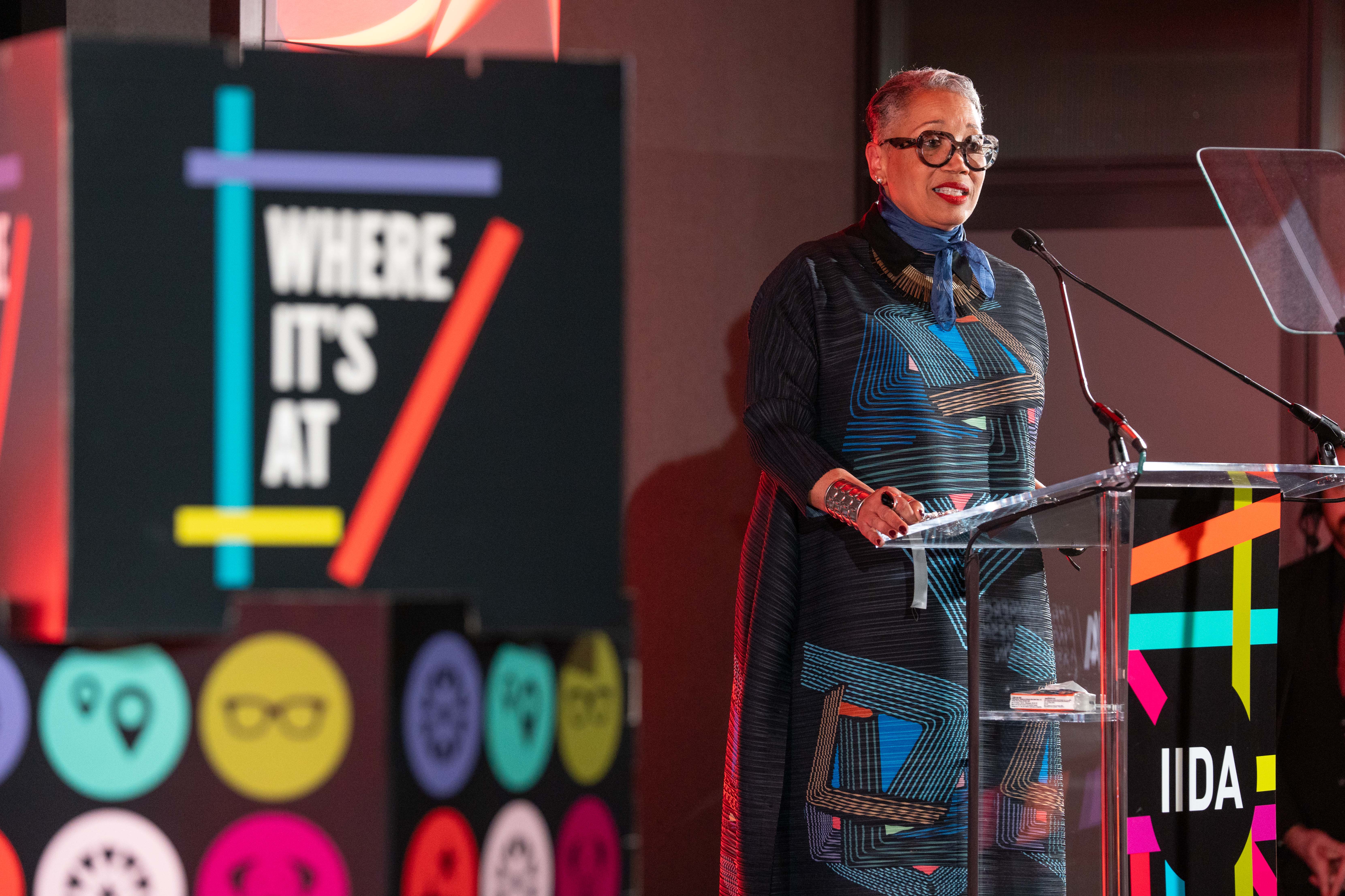
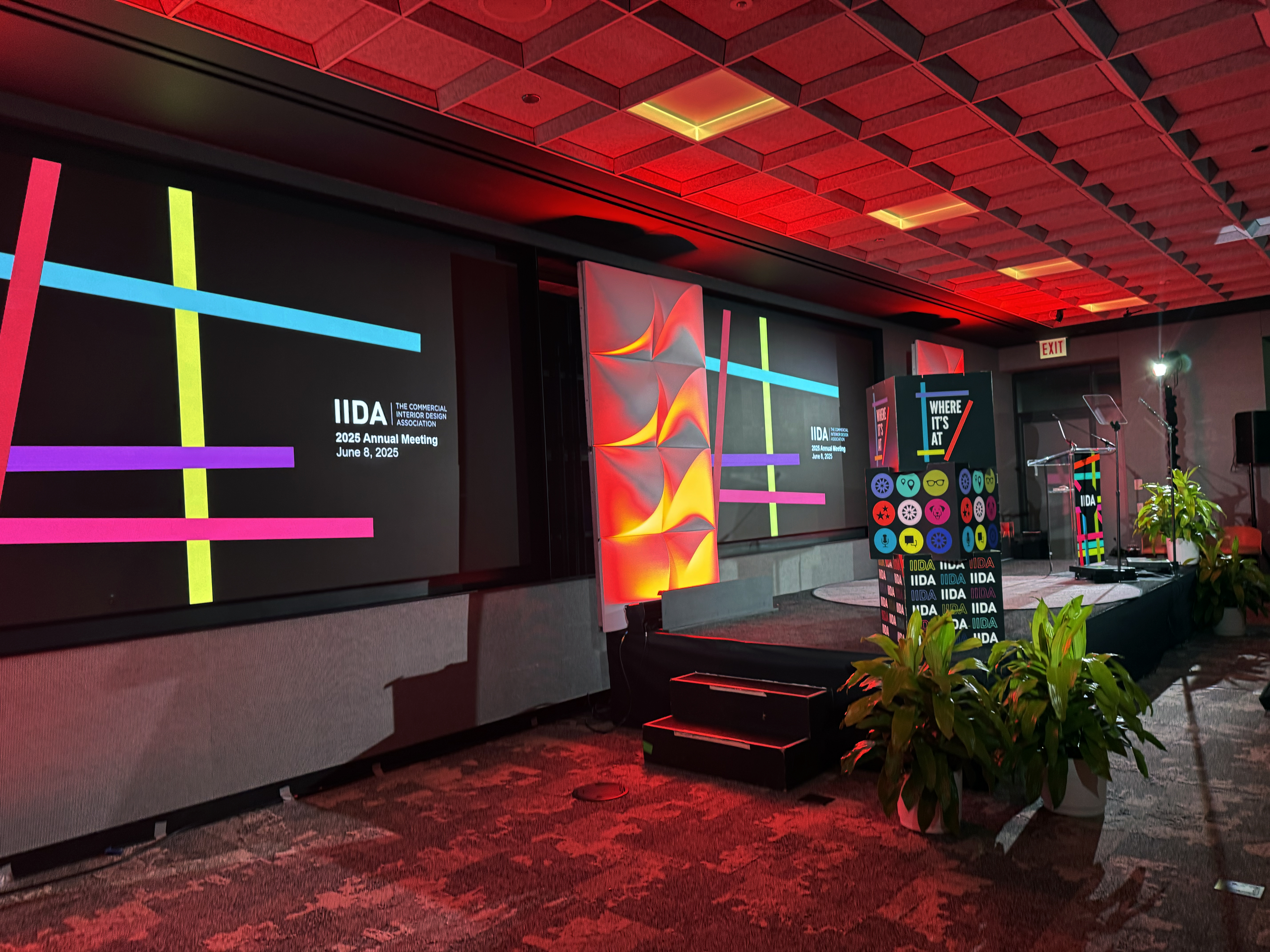
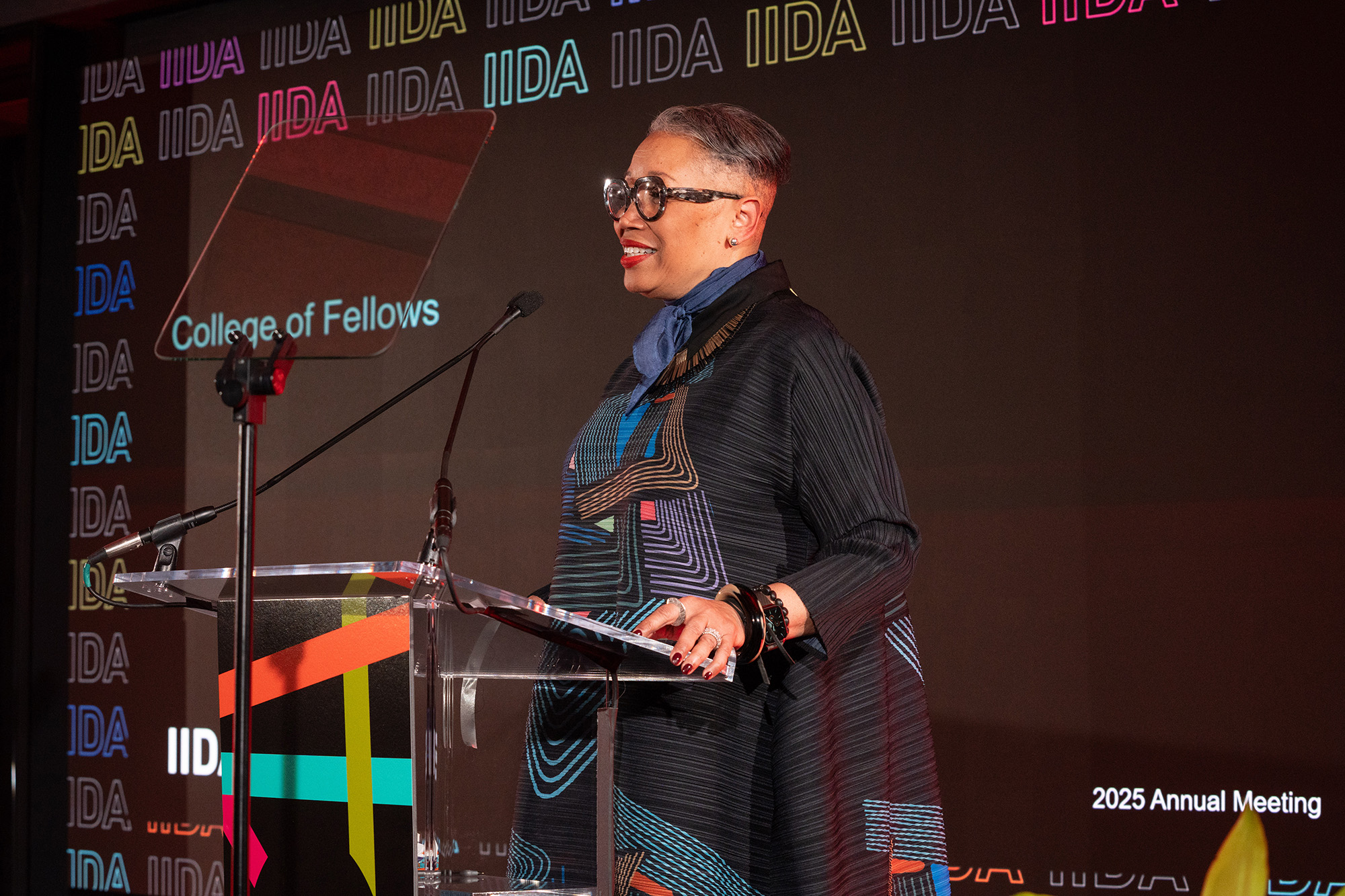
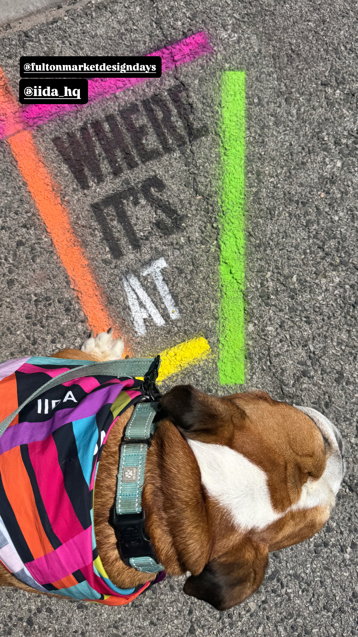
“Where It’s At” was the campaign direction for IIDA's Chicago Design Week which includes NeoCon and Design Days, annual design industry events in Chicago that showcase the latest in commercial interiors, furniture, and innovation through exhibitions, programming, and activations. IIDA, the International Interior Design Association, plays a key role by hosting panels, competitions, events, and its signature celebration, Revel in Design, to connect and inspire the design community.
The theme operated on both a literal and figurative level, anchoring the campaign in a specific place while speaking to the moments design inhabits i.e. IIDA is where design is at, where designers are at, where the future of design is at.
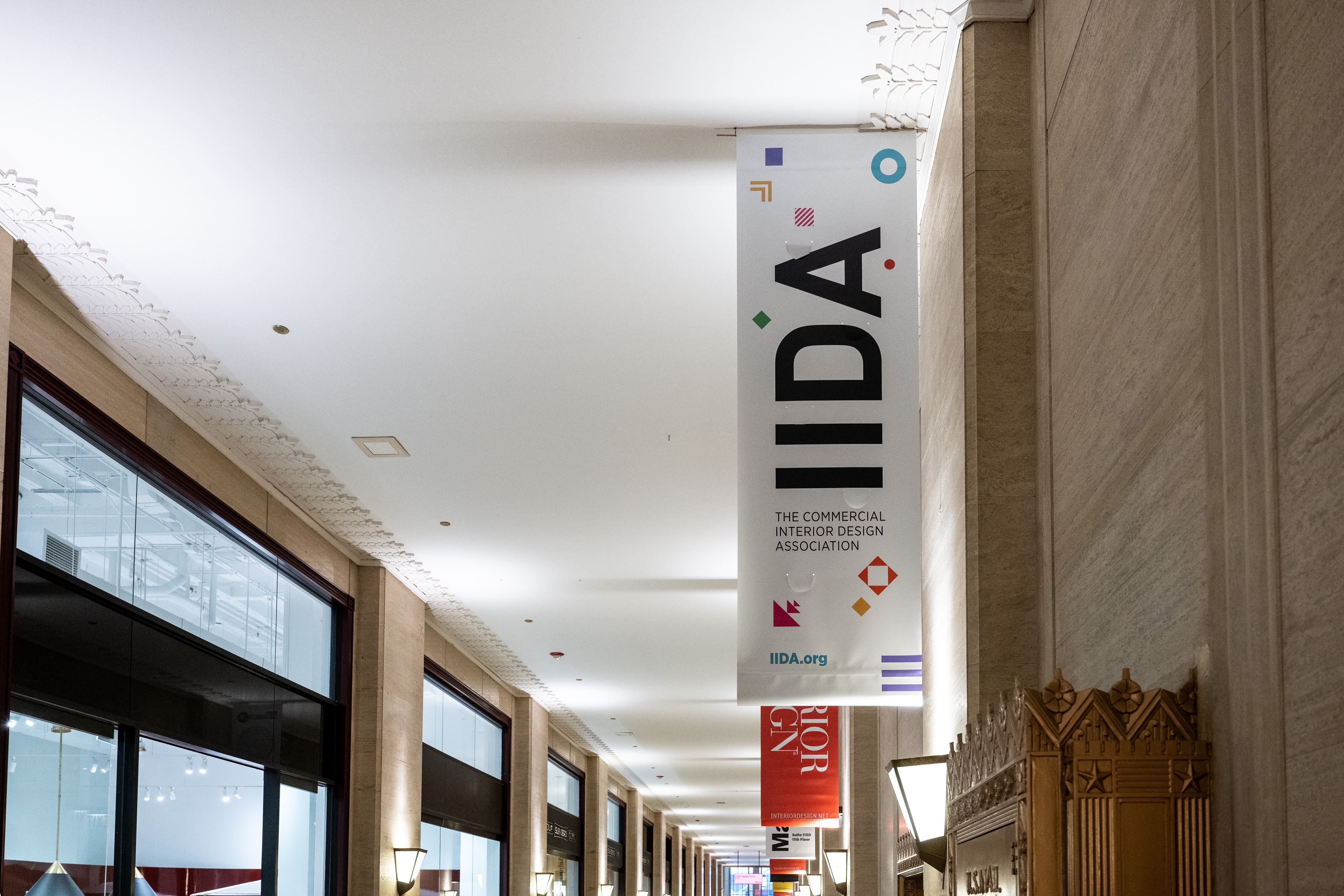
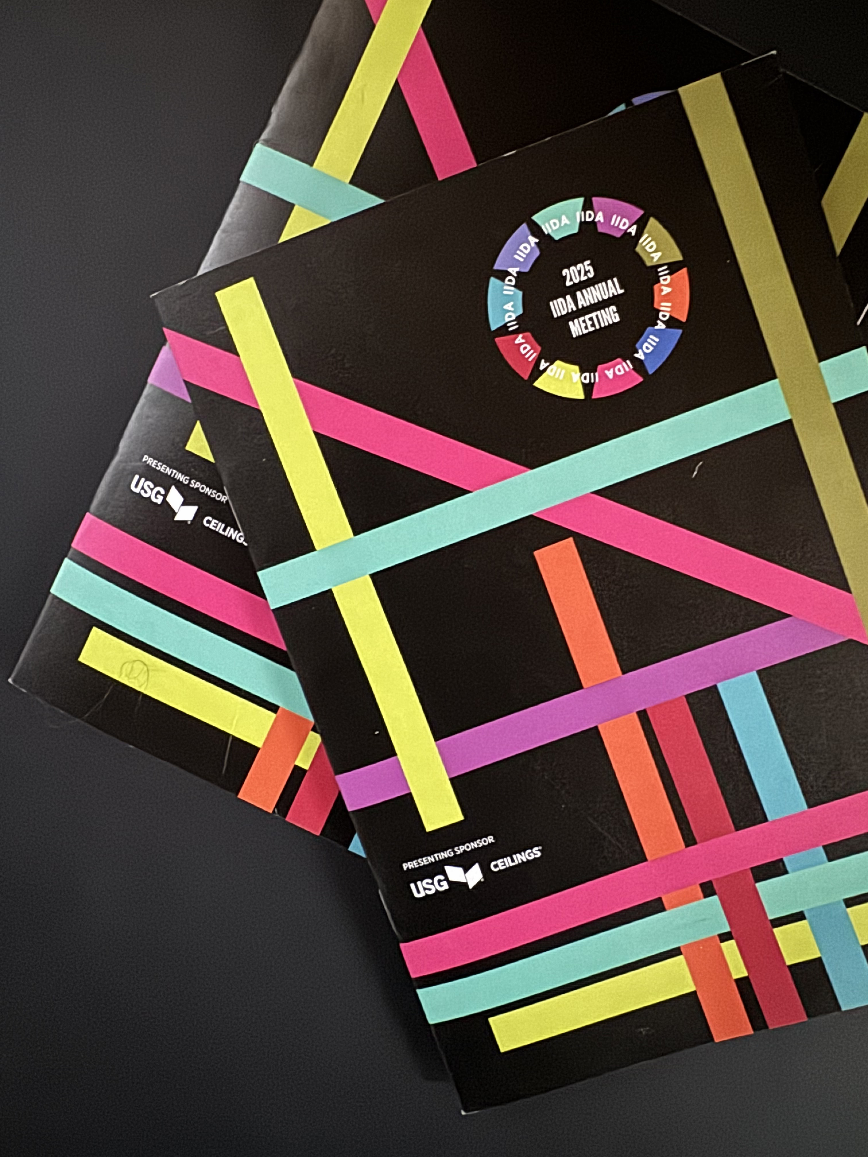
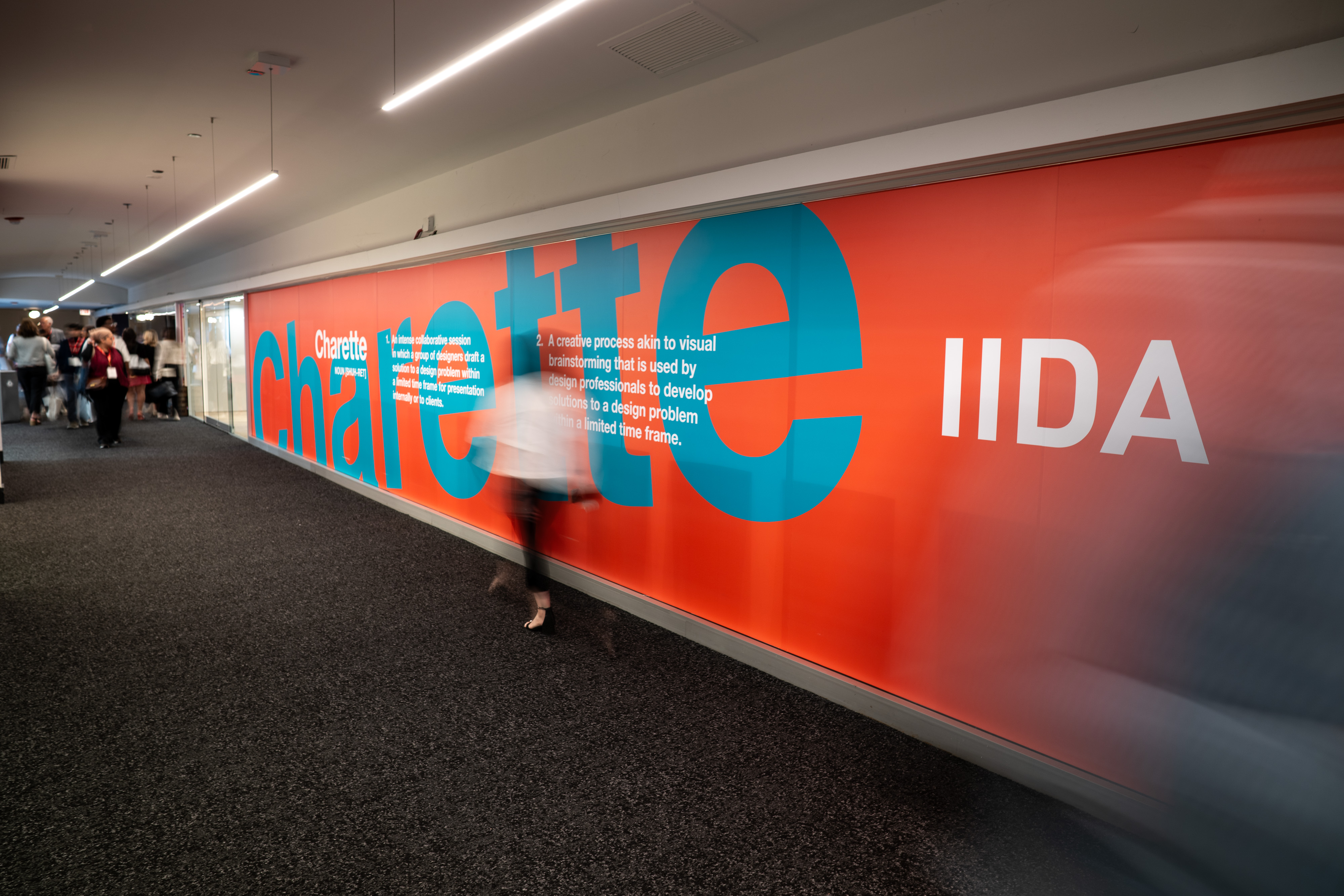
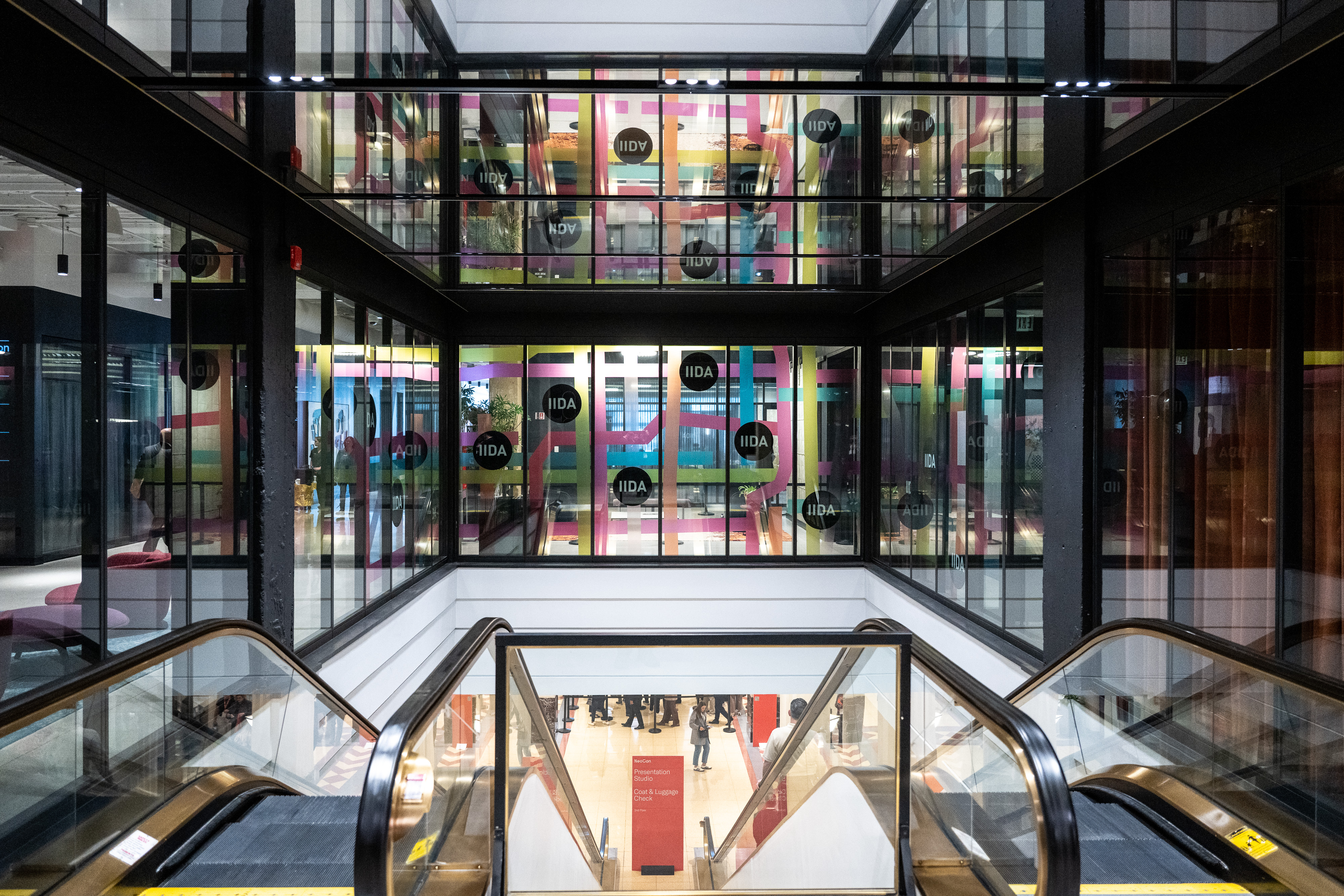
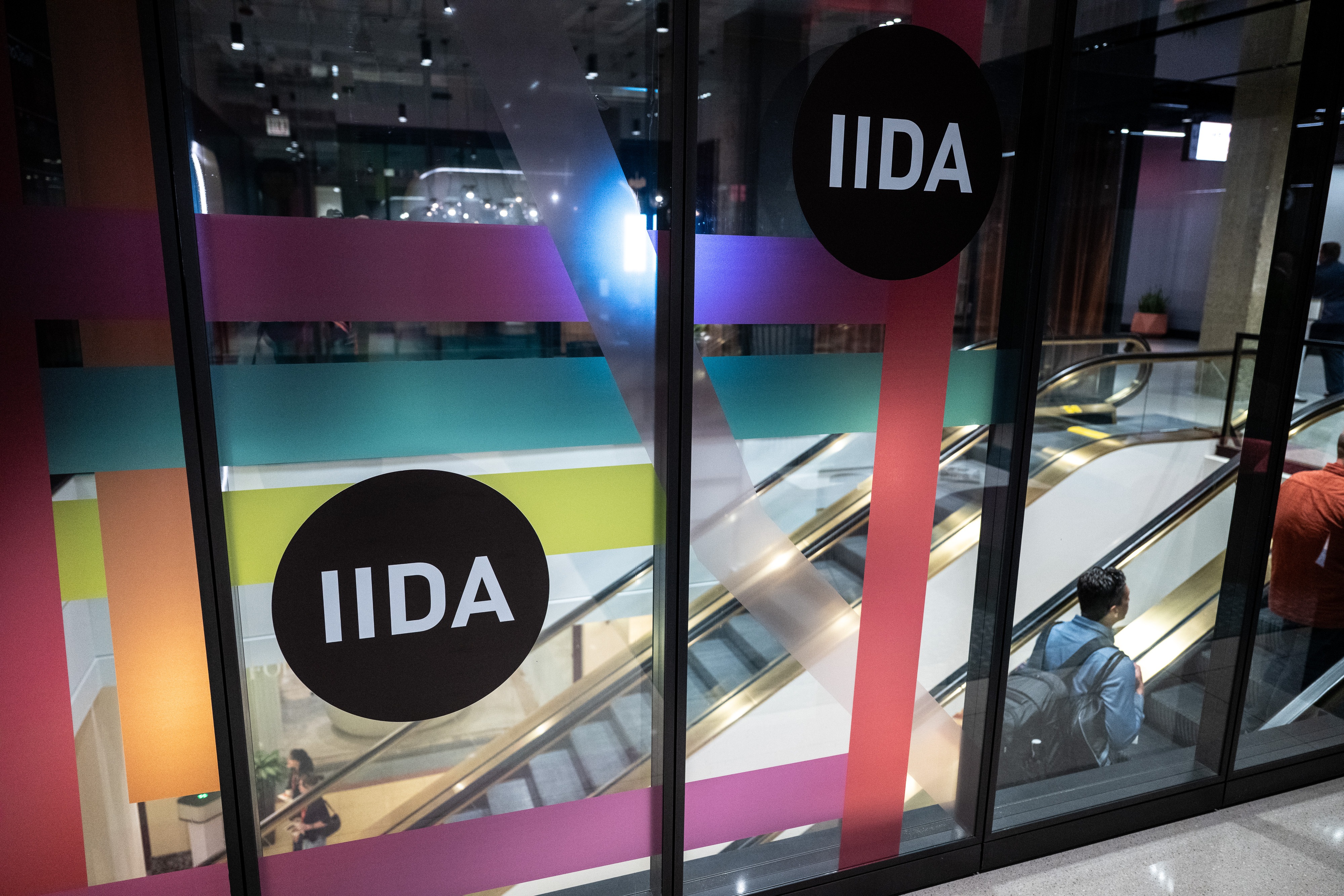
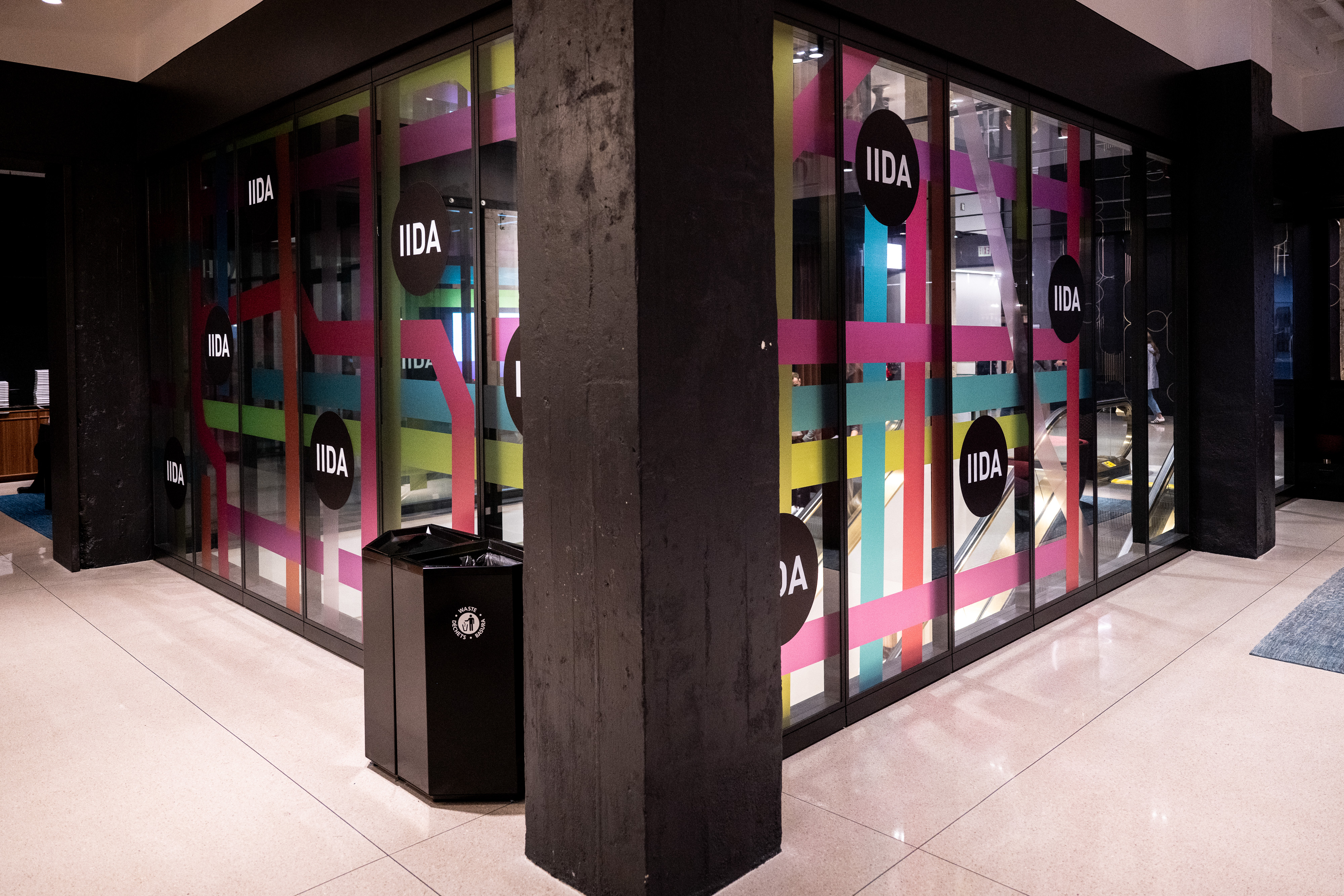
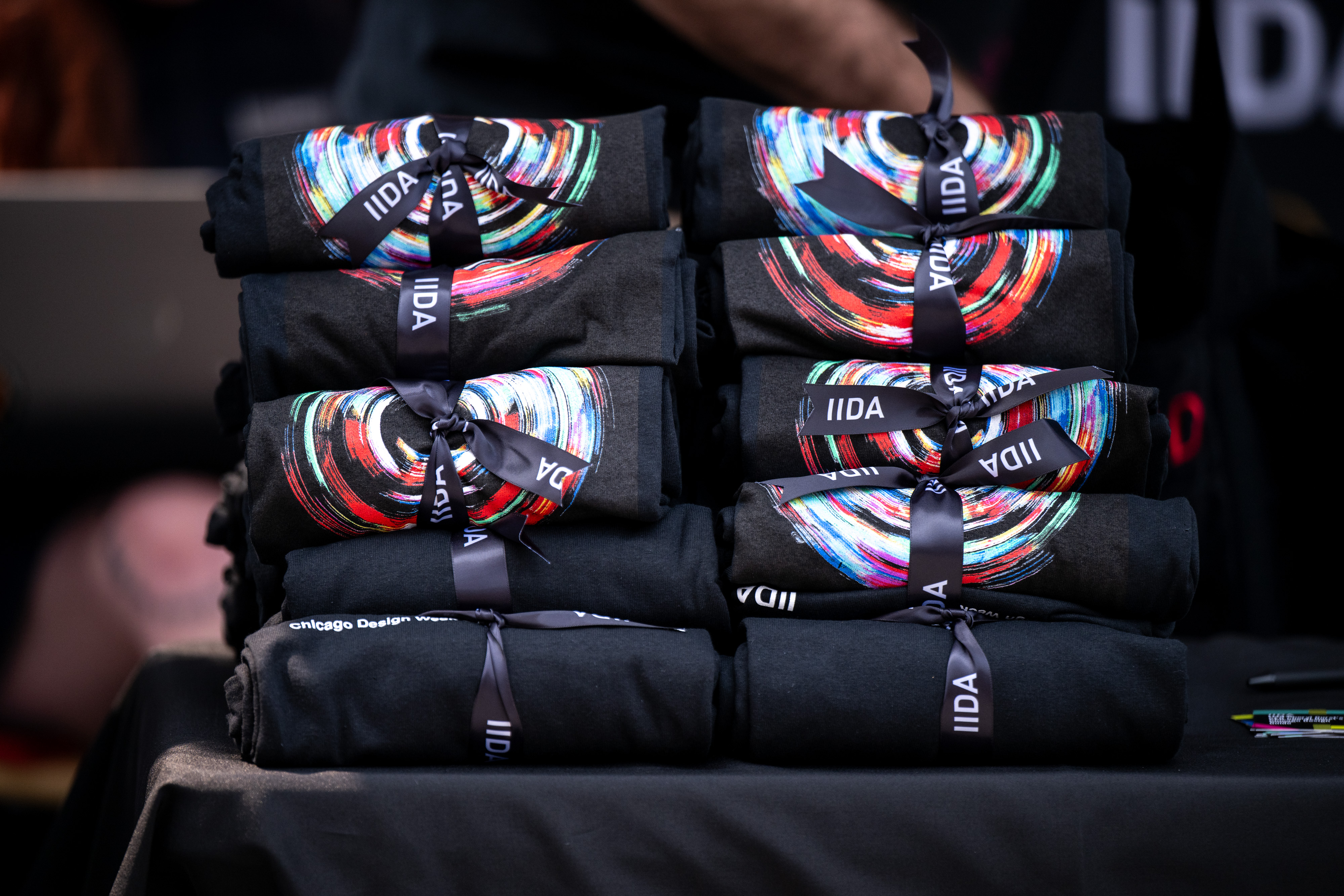
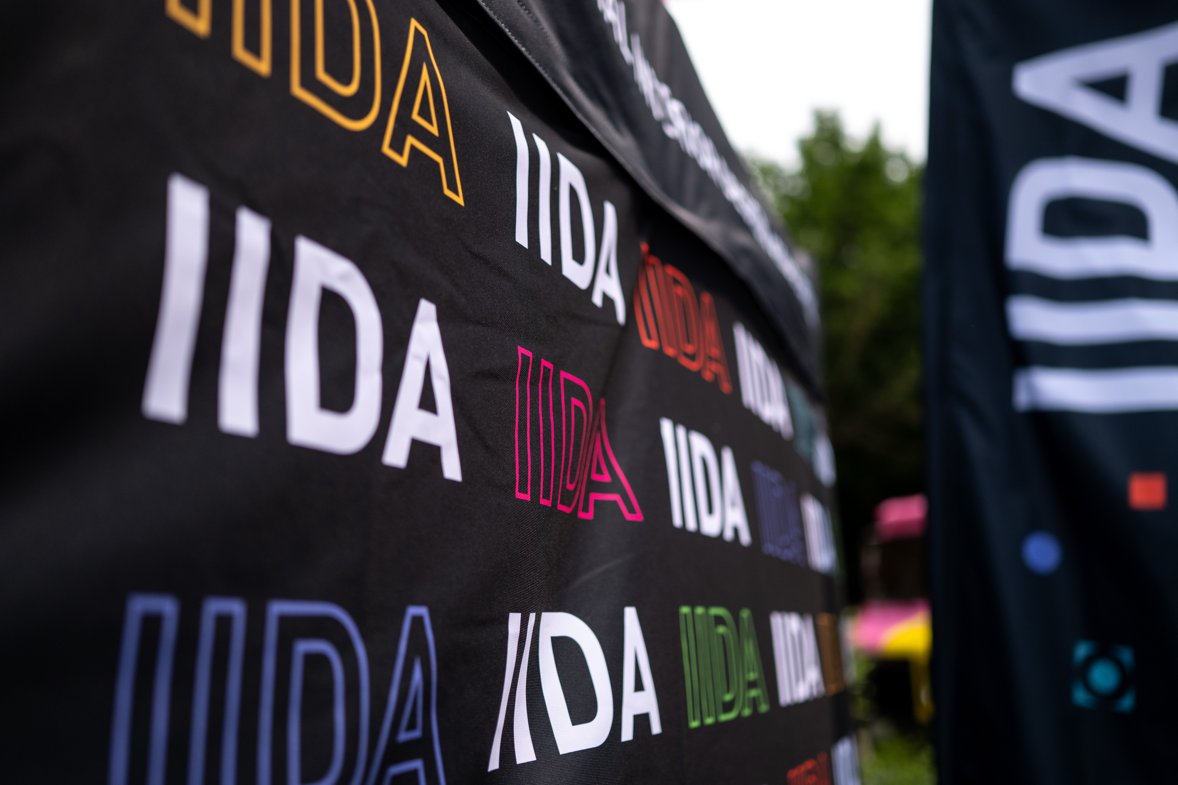
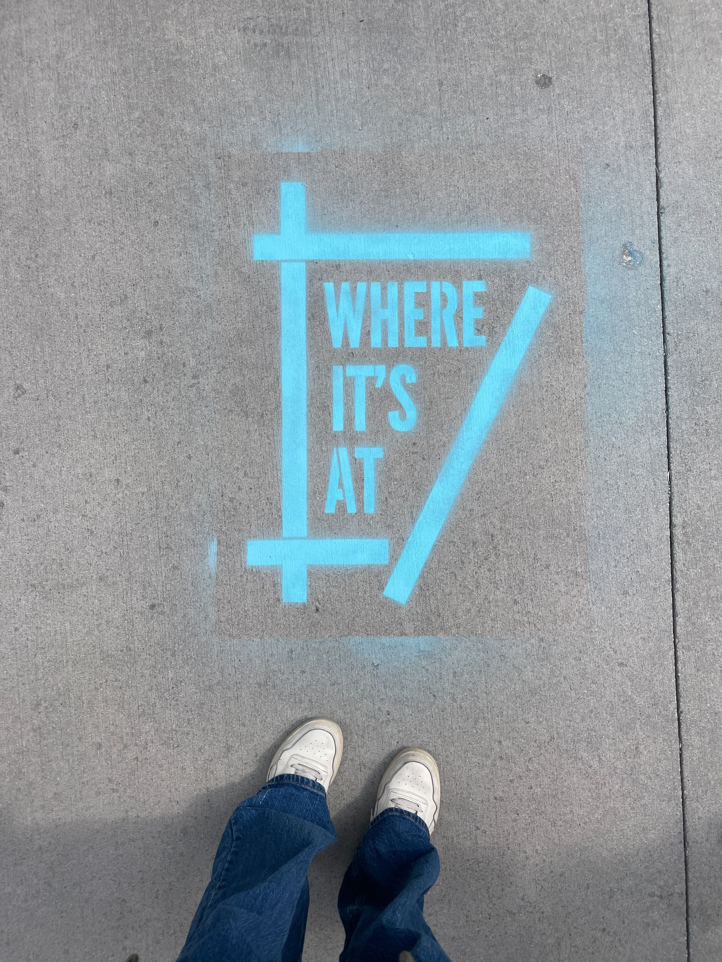
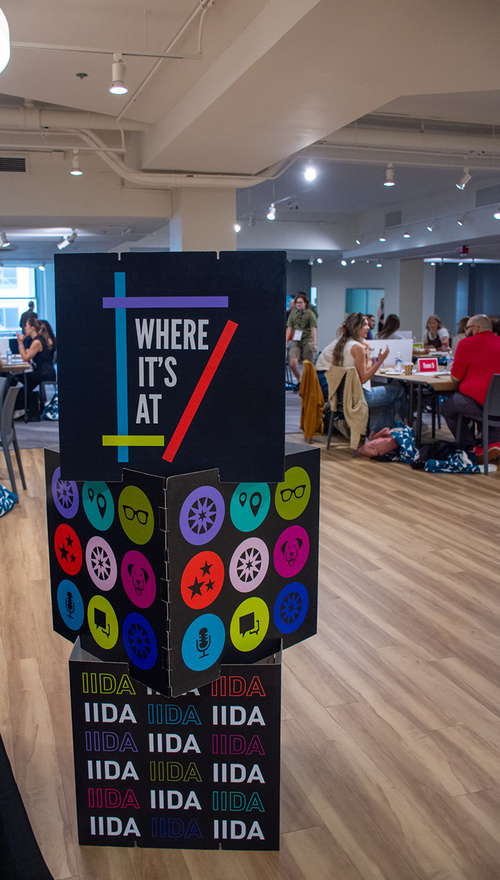
An abstracted, oversized map of Chicago guided the visual direction along with a series of illustrations to balance out the hard lines of the map and introduced more playful elements used throughout the campaign. The primary corporate color palette plus the addition of two new colors-maintained consistency with broader marketing efforts and felt fresh in various applications that included everything from large scale environmental graphics with bold shapes and oversized typography to spray chalk on a city street. A custom logo word mark was created and featured prominently across marketing materials, also appearing alongside the icons as chalk stencils, buttons, pins, and other touch points throughout the week. A custom pop-up installation—including playful "design dogs"—added a celebratory and uplifting element to one of the many experiences happening during a busy time.