
Logo Development
Industry
Food Retail
Company
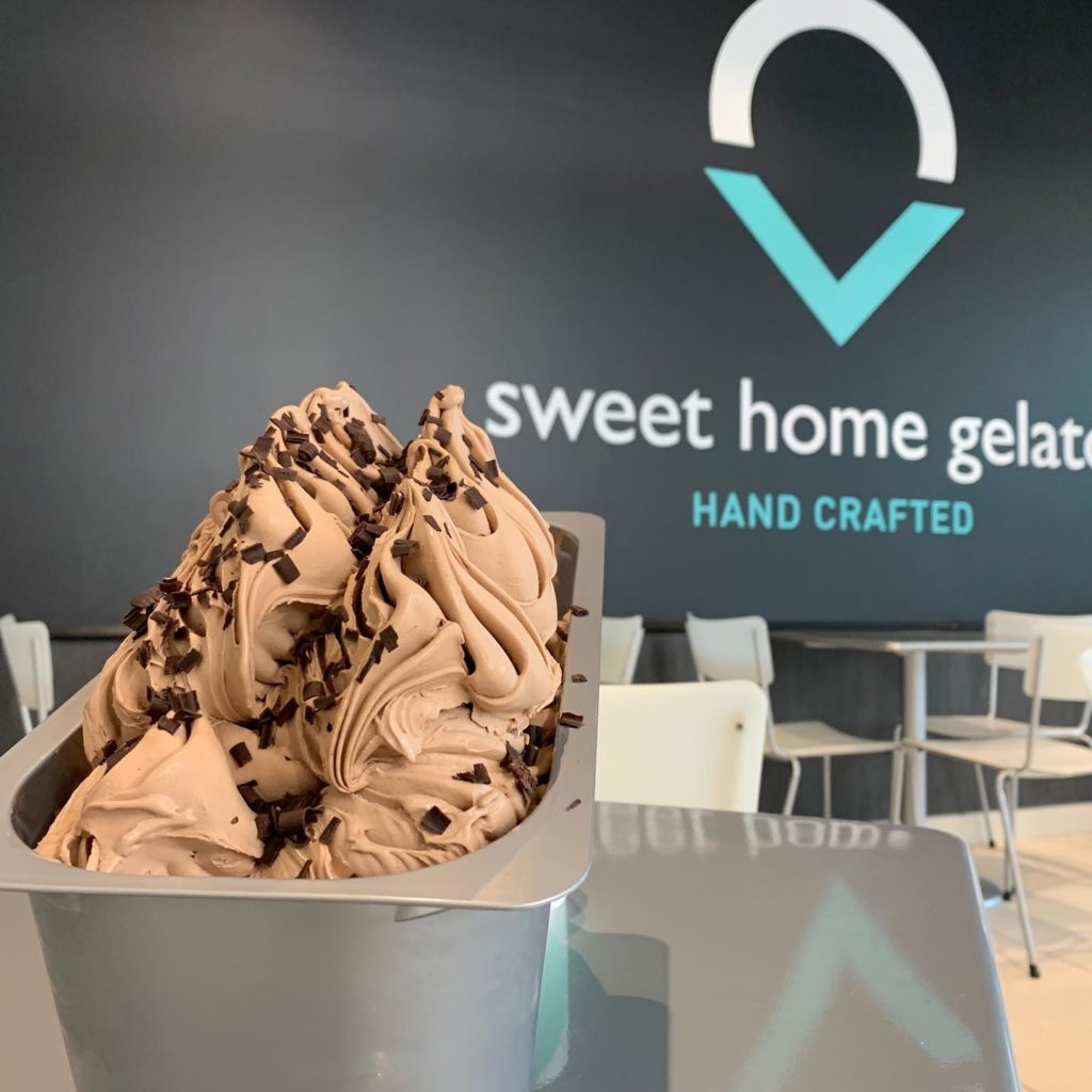
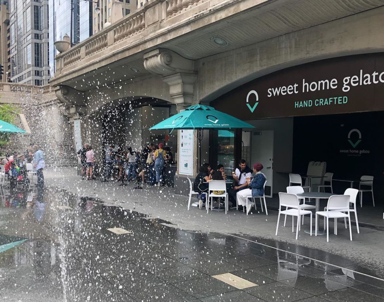
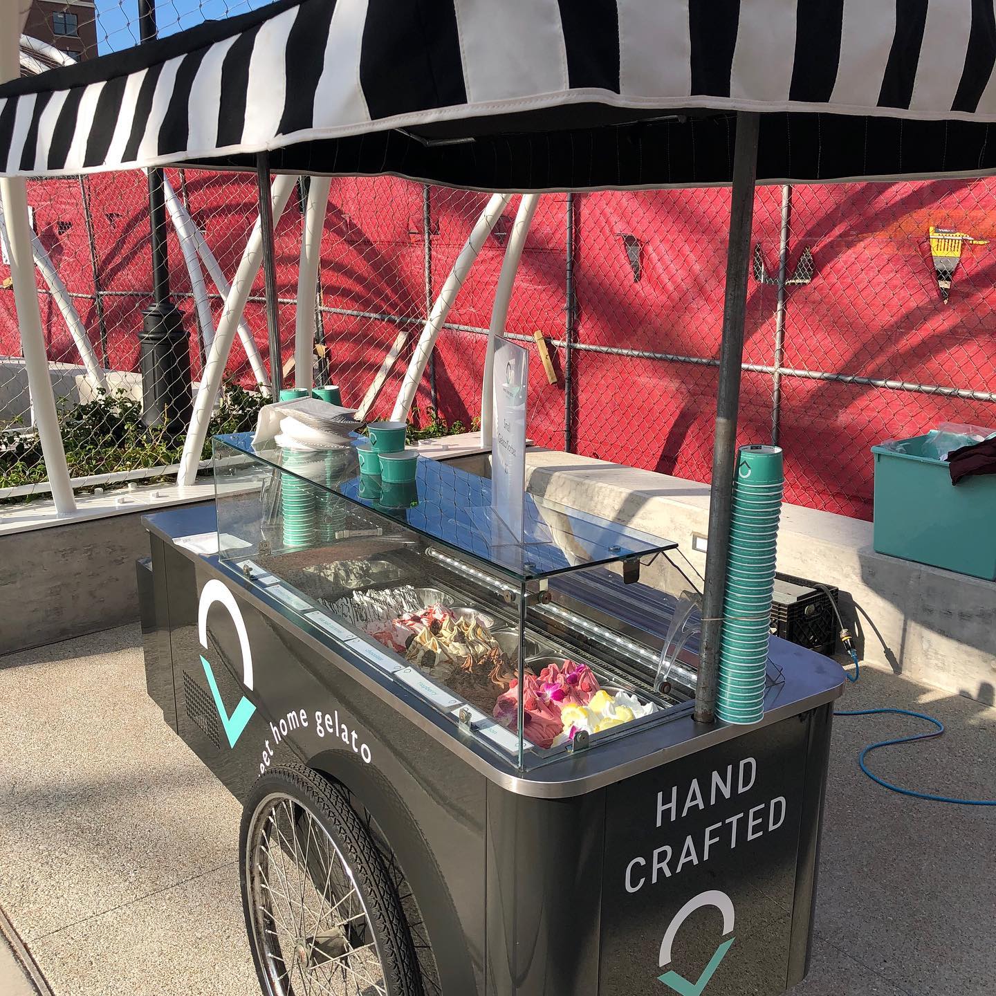
Sweet Home Gelato
Sweet Home Gelato is an upscale gelato store in the tony suburbs of Highland Park and Naperville with a location during the summer on Chicago’s Riverfront.
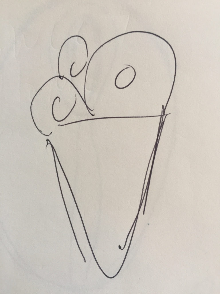
The owner wanted an identity that was contemporary and easily identifiable to his upscale clients. Nothing overly whimsical, childish, or retro, as you often see with dessert companies. Working with an interior design concept developed for the stores, the identity needed to complement the direction of the physical space. The store concept was both warm and sophisticated, and when developing the mark wanted to make sure that it would work with new store systems and environment. The name plays homage to Sweet Home Chicago while also conveying a local presence in the communities they serve. The icon was developed as both a symbol of the product and as a location marker, centering the point above the word “home”.
The colors used play off the cooler colors associated with frozen desserts, with a mint as the gelato and a dark gray as the cone. Type used in the name is a clean modern san serif typeface, all set in lower case, to convey an approachable feel.